Overview
Quick Data
- Setting
- Developing initial launch product as UX Designer at Vosyn
- My Role
- Collaborated with team to conduct usability testing, iterative design, and AI-powered validation. Drove ideation and organized workflow.
- Team
- 3 UX Designers, 1 PM, 1 PO
- Tools
- Figma, Figjam, Google Suite, Fathom
- Timeframe
- 6 months
Summary
Note: NDA warning
Certain information has been intentionally obscured or omitted in accordance with a non-disclosure agreement. As a result, some details may be incomplete or redacted to protect proprietary or sensitive content.
Context
Vosyn is an AI platform that opens global content to all, removing langauge and cultural barriers by seamlessly localizing media. In the process of preparing its Beta version for launch, the startup has successfully raised $8M in its first round of seed funding.
Problem
Although the product had features to help users understand global content, testers struggled to locate these key features, finding the interface cluttered and difficult to parse. It was up to our team to resolve these issues and elevate the design so users can take advantage of the product’s innovative features from launch.
Impact
Redesigned the content page layout to surface the key features that help users fully understand their selected content.
Cut visual noise, directing users’ attention straight to their desired features.
Users were x2 faster and +40% more successful at locating and using key features.
Process
- Research: Usability testing, affinity diagram, quantitative analysis
- Define: “How might we?” question.
- Iterative Design: User flows, wireflows, and high-fidelity prototypes.
- Validation and hand-off: Usability & A/B tests, then hand-off to developers.
Research
Usability Testing
Methods
We conducted think-aloud usability testing with 12 participants, particularly focused on the product’s flagship features. We used affinity diagramming for qualitative analysis and spreadsheets for quantitative analysis
Findings
Cluttered interface blocked feature access
Participants noted that the interface was cluttered and overwhelming–a result echoed by middling success rates.
Participants missed the feature entirely, or went through unnecessarily extensive navigation paths before being able to locate it.
Misleading signposting hindered task success
Misleading signposting for some features sent users away rather than grabbing their attention, which prevented task success.
Goal
How Might We?
How might we streamline localization feature access so that users can better understand and engage with global media?
Design
Ideation
Each team member ideated from a different angle: I focused on the big-picture and overall structure while my teammates focused on individual features.
User Flows
To prioritize the user experience and journey, I created user flows to visualize how users might interact with the product, and to identify key interaction points and dependencies. This helped me group related features and find each feature’s appropriate spot in the experience path.
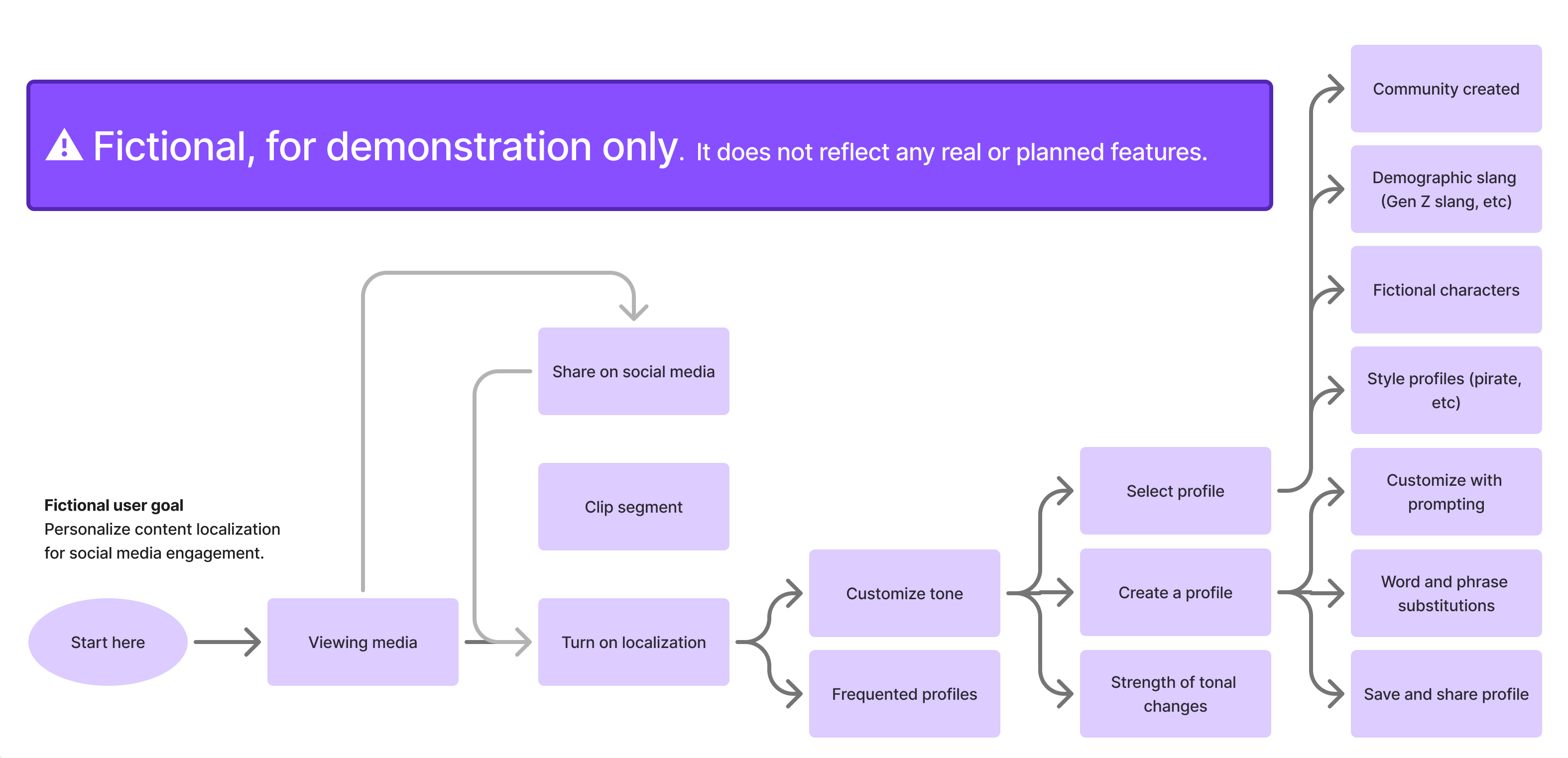
Wireflows
To refine the concepts and communicate them to stakeholders for feedback and buy-in, I built on the user flows and developed wireflows using low-fidelity sketches.
Top De-cluttering Ideas
The userflows and wireflows resulted in 3 ideas for hiding details when they're distracting, but surfacing them when needed.
- Idea 1: Flow-based. Strengthens user focus since features are only available at relevant moments in the user flow.
- Idea 2: Static menu. Gives users a clear starting point, shows what’s available, and enables access anytime via a persistent navigation element.
- Idea 3: Portal. Emphasizes the range and number of features available; a “library”-like model.
Finding Direction: Idea 1 + Idea 2
Although all three ideas fulfil the design goal, we had to consider:
- Does it align with the company’s vision for the product?
- Is it easy to learn, enabling users to engage immediately?
We held a group review session where the project manager and peer designers critiqued the designs based on user needs and company goals.
Thus, we decided on a mix of Idea 1 (Flow-based) and Idea 2 (Static menu). We would have a persistent menu to: anchor the user experience, emphasize key features, and drive engagement; while allowing secondary features to only bubble up at key interaction points to minimize cognitive load.
Drilling down: Prototypes
My teammates helped update the existing designs to the new structure and layout. Throughout, we collaborated to ensure our designs were in sync–avoiding conflicting interactions, and applying shared design patterns and standards.
In addition, to ensure alignment with product vision, we had consistent check-ins with the PM and implemented feedback.
Mid-fidelity & high-fidelity prototypes
To refine the layout and interactions, I created and iterated on mid-fidelity prototypes, then refined it into high-fidelity. Throughout the process, I implemented my team’s insightful and user-centered feedback.
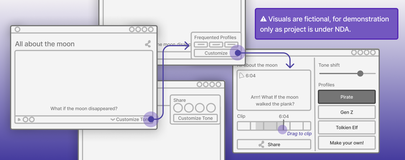
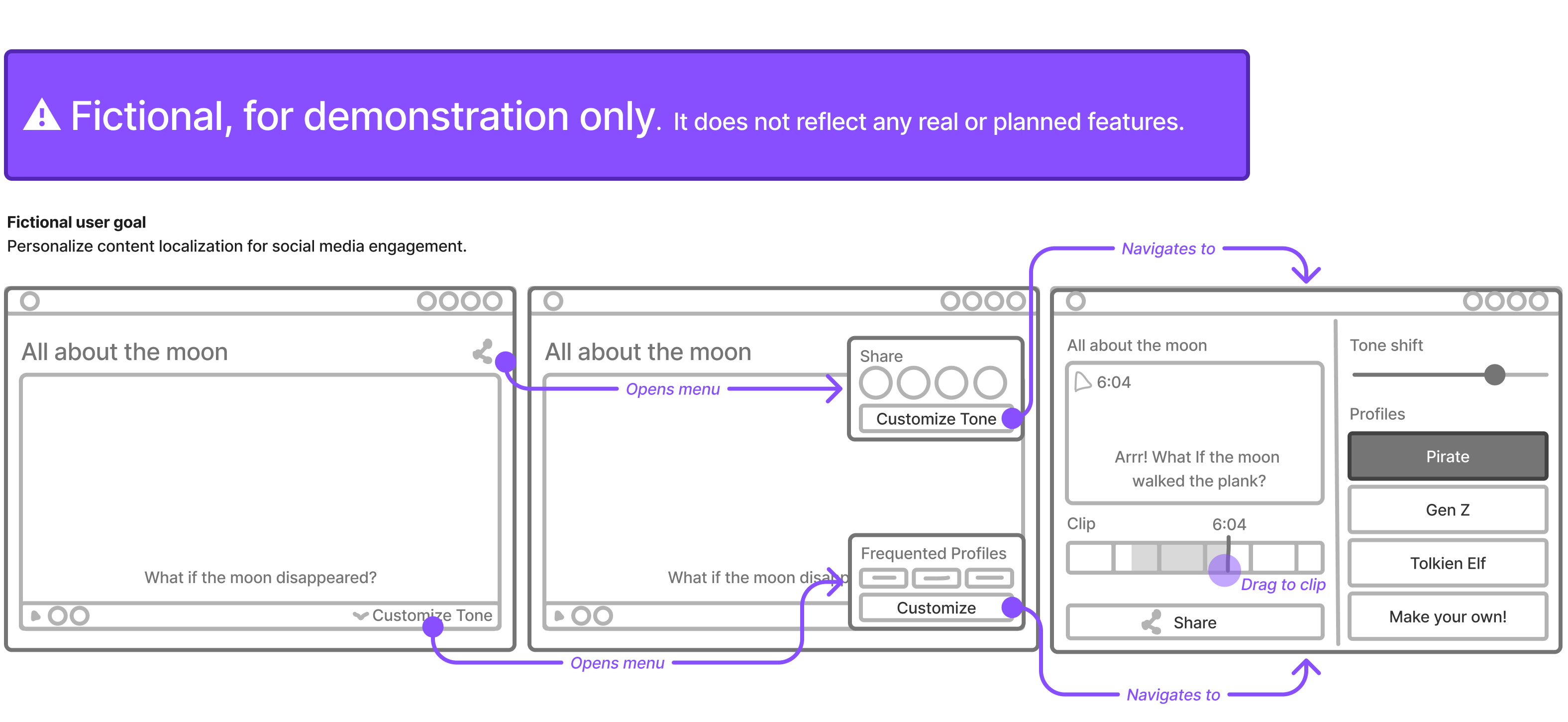
- Defining layout & interactions of the static menu: I iterated on layout, visual aesthetics, and interaction flow. In particular, a challenge was fulfilling the user need of multitasking without overcomplicating the interaction. We eventually landed on a standardized, static sidebar layout with a simple 1-click customization flow. The final design balanced visibility with simplicity, reducing cognitive load while still providing easy access to the features.
- Separating out features to be flow-based: I also worked on designing and adapting certain features for flow-based access. Based on where and when users encounter a feature (such as through the menu vs during a key interaction), the design would adjust to context and intent. For instance, a prominent overlay offering in-depth control versus a 1-click access with a subtle success message in fullscreen.
Validation and Hand-Off
Outcome: Validated success!
To validate the designs, we turned to AI-powered testing due to security risks of leaks from using human testers.
Results
The final design was a success:
- Increased instances of task success (as much as +40%)
- Faster task completion times (as much as twice as fast)
- Higher scores on users’ comfort level (20% increase in score)
I conducted 2 rounds of AI validation:
- Usability testing
- A/B testing
Both validated the new design, with resounding improvements in all metrics.
Validating the validator
Since the validation was done with AI, we had to check if the results were trustworthy. Before running the validation on the new designs, I first ran synthetic testing on the original design.
Comparing the AI’s results with the human testing data, we found that the AI results were trustworthy as it highlighted the same issues that plagued our human testers.
Thus, we were able to validate AI validation and have confidence in the success of the new design.
Developer Hand-off
With the design approved with stakeholder buy-in, we handed it off to the development team with design documentation, answered questions on the designs, and supported our design decisions. I also checked-in with the product owner (PO) to review user stories, see the implementation results, and suggest quality assurance revisions.
Takeaways
Synthetic testing and validation
AI-driven synthetic testing helped us save time and resources without compromising quality. While it doesn’t completely replace human testing, it lets us test and validate our designs quickly, cheaply, and safely. We still needed to design thoughtful tasks, guide the focus of each test, and compile results into a clear, actionable format, but by automating the more time-consuming parts, (like recruiting, conducting sessions, and analysis) we could reserve human testing for critical moments, making the most of limited resources.
Simplicity & feedback
This project helped me realize that I tend to overthink and create complex solutions. Although complexity is sometimes necessary, simplicity tends to maximize usability. In this project, collaborating with others with frequent critique sessions pushed me towards simple solutions that balance clarity with impact. It was beneficial that I tended to brainstorm multiple options, as this meant exploration and comparison of both simplicity and complexity, enabling the best option to be selected. Thus, my takeaway is to push myself for simplicity and to keep brainstorming multiple ideations.