Overview
Quick Data
- My Role
- Completed the project solo, conducting interviews, usability testing, and design, from lo-fi sketches to animated mockups.
- Setting
- Student Project at Arizona State University
- Tools
- Figma, After Effects, Google Suite
- Timeframe
- 1 month
Summary
Context
Libby is a library app allowing patrons to borrow and read e-books, audiobooks, magazines, and more, offered by more than 2200+ public, academic, and corporate libraries. I personally found it difficult to navigate and explore the Libby catalog in a meaningful way, which led me to investigate whether others faced similar barriers.
20% of participants were obstructed from effective exploration, preventing them from meaningfully using the library service. Additional issues such as information overload and lack of user-prioritized data further obstructed exploration for other users.
Solutions
Targeted solutions ensure value across diverse user journeys, especially for the overlooked user profile.
Streamlined the experience by removing redundancy, clarifying button labels, and refining site structure so users easily understand how to navigate and find what they need.
Enabled users to evaluate titles quickly by providing the data that users depend on for book discovery, formatted in an effective layout.
Process
- Discover: Interviews, usability testing, heuristic evaluation, web accessibility guidelines evaluation
- Define: “How might we” questions
- Develop: Brainstorming, iterating, low fidelity sketches, mid-fidelity wireframes
- Deliver: High fidelity wireframes, animated mockups
Discover
Interviews
Methods
To understand users’ real-life contexts and unmet needs when it comes to book borrowing and discovery, I talked to 5 participants who ranged from casual readers to bookworms, with varied interests including comedies, period dramas, and STEM.
Findings
Consistent preferences individually, but high variance as a group
While individual readers had consistent reading preferences (such as a reader who loves romance and thrillers, or one who only reads STEM material), the overall group of readers showed a wide range of interests.
This indicates an opportunity for personalized content suggestions rather than a uniform approach.
Key decision-making cues missing
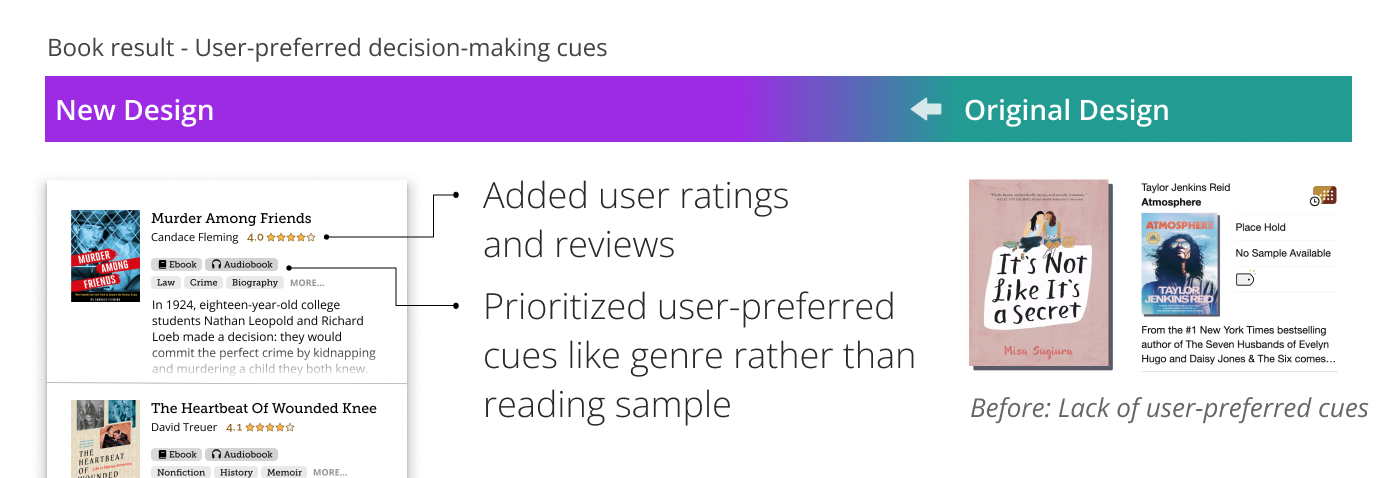
Genre and user reviews were consistently cited as essential when deciding whether to borrow a title. However, these cues are poorly supported with most titles having only 1-3 genre tags, and no user review system at all.
Introducing granular genre tagging and community-driven features like user reviews and ratings would enable users to easily evaluate titles during discovery.
Usability Testing
Methods
To see how users approach book discovery and to identify friction points in the user flow, I conducted usability testing with 10 participants. This provided meaningful insights into user behavior and confidence for grounded design decisions.
Findings
Participants exhibited the same patterns of behavior, out of 3 possible patterns
Participants exhibited only 3 patterns of behavior when looking for a title to borrow: using filters, using recommendations, or using the search bar with a title in mind already.
This presents an opportunity to offer targeted solutions for each pattern of behavior.
Weak filtering system prevented book discovery for selective readers (Pattern 1)
Participants who had a particular genre or combination of genres in mind relied on the filter system. However, a clunky filtering system and lack of genre tagging (most titles were only tagged with 1-3 genres) led to frustration and prevented meaningful exploration for these users.
Heavy reliance on recommendations (Pattern 2)
Most participants depended on recommendations for book discovery. This included librarian-curated recommendations like age-segregated lists, critic recommendations like “NPR’s top 50 picks,” and genre-centered recommendations.
This indicates the importance of keeping these recommendations prominent and easily accessible.
With a title in mind, some ditched discovery (Pattern 3)
Some participants had a specific book in mind and simply used the search bar rather than attempting to explore titles.
This indicates the value of highlighting the search bar for this pattern of behavior.
Heuristics Evaluation & Web Accessibility Guidelines Evaluation
Methods
An evaluation drawing from research-backed psychological principles and Dr. David Travis’ Web Accessibility Guidelines helped uncover general usability and accessibility issues that might not surface in user testing but still pose barriers to users.
Findings
Unclear icons
The set of icons used to indicate title availability are not easily understood as they are custom, non-standard icons with abundant visual overlap within the set.
Although the icons technically fulfil the accessibility guideline requiring text descriptions for icons, it fails in practice as the text description is hidden behind an interaction with poor discoverability.
In total, these compounding issues end up hiding rather than clarifying a title’s availability status.
Unclear site structure for recommendation guides
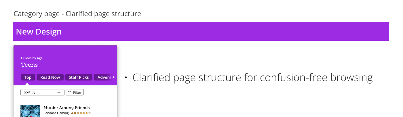
The “Teen Guides” page appears to display a single list of books, but it actually contains several different lists.
This disconnect violates the accessibility guideline that recommends users to be able to understand a site’s structure at a glance.
This issue was also confirmed during usability testing, where it caused confusion and slowed down at least one participant’s progress.
Information overload
As a digital catalog, reducing cognitive load is critical. However, two design choices contribute to information overload:
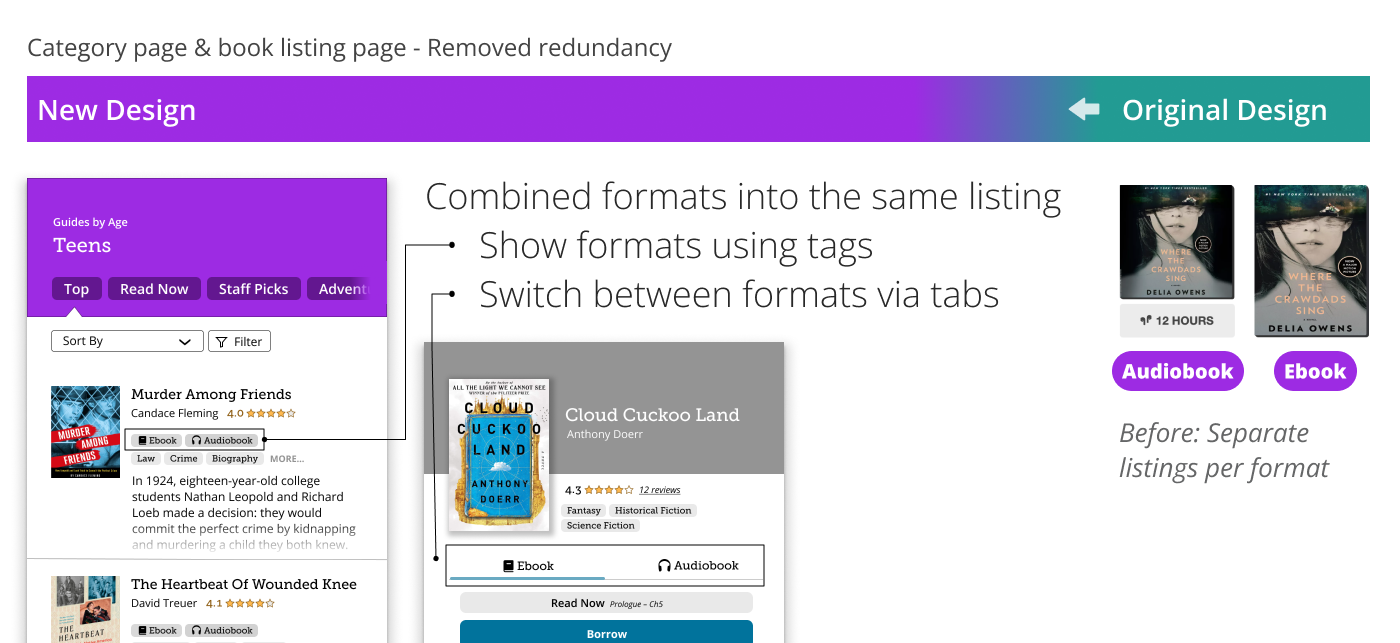
- Ebooks and their audiobook counterparts are listed separately, resulting in redundant listings.
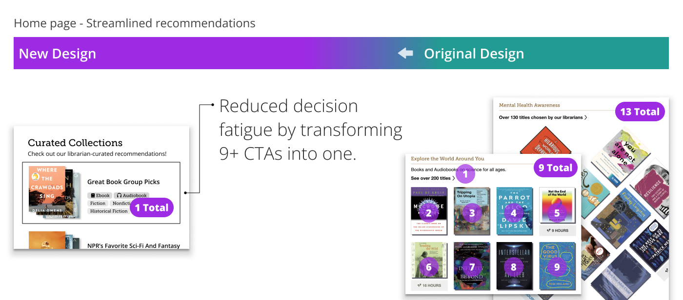
- Each curated recommendation list displays 7 calls to action (the top 6 titles plus a “see more” link) when users might not even be interested in the particular subject covered by the list.
These patterns clutter the interface and overwhelm users with too many similar options at once.
Define
How Might We?
With discovery complete, it was time to define the direction and scope of the redesign with “how might we” questions.
At the core:
How might we support diverse discovery behavior patterns (especially the neglected profile of selective readers) while reducing noise and helping users quickly grasp key information?This overarching challenge can be broken down into three key areas:
- Discovery and Personalization: How might we support varied content preferences and behavior patterns (one-minded discovery ditchers, recommendation-reliant readers, and filter-based picky readers) in a cohesive experience?
- Cognitive Load and Structure: How might we clarify and simplify the interface so users understand where they are and what they’re seeing without being overwhelmed?
- Decision-Making Cues: How might we help users effectively evaluate titles by surfacing the information that matters during discovery?
Develop
Brainstorming
To find solutions, I started by listing down ideas–brainstorming new features as well as including existing Libby features. Evaluating each based on alignment with user needs and learnability, I was able to find a direction for the redesign.
- Targeted solutions for discovery and personalization: In particular, a new personalized suggestions feature would target the neglected user profile of selective readers while refinements of existing features like curated recommendations and the search bar would target the other two user profiles of recommendation reliant users and discovery ditching users.
- Structural and visual design changes to cut cognitive load and clarify structure, like merging redundant listings and replacing mysterious icons with descriptive text.
- Display user-prefered decision-making cues such as adding user ratings and reviews, emphasizing genres, and so on, enabling users to evaluate titles quickly for efficient and effective discovery.
Sketches and Wireflows Exploring Layout & Flow
After prioritizing key features, I used low-fidelity sketches to quickly explore how they could fit together and what they might look like. Here are some examples.
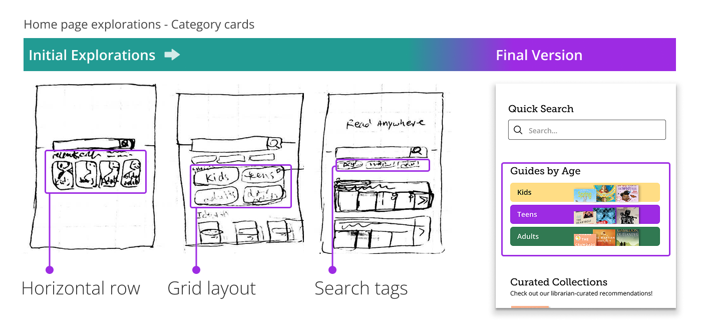
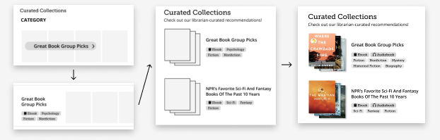
Skimmable Categories: The final result is vertically stacked cards to match human scanning patterns. Explorations included a horizontal layout, a grid layout, and search tags. The former two were dismissed for slow scanning while quick-search tags were dismissed due to low visibility.
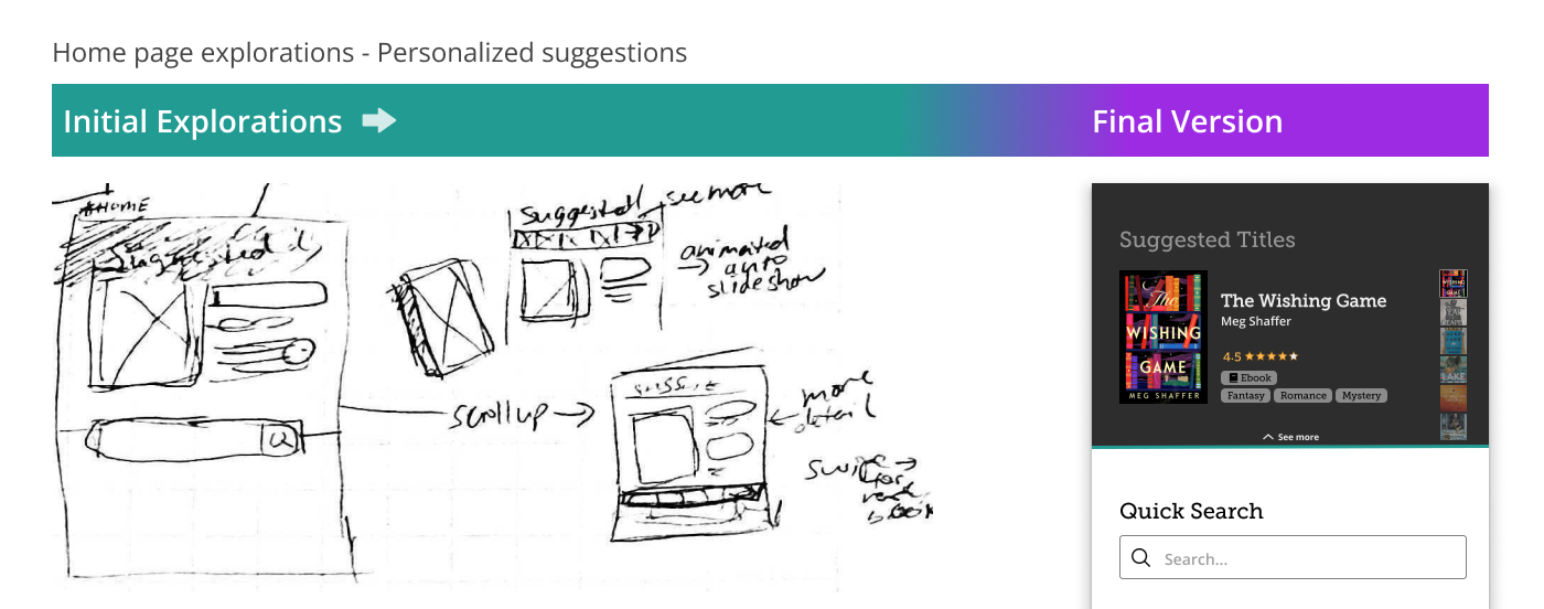
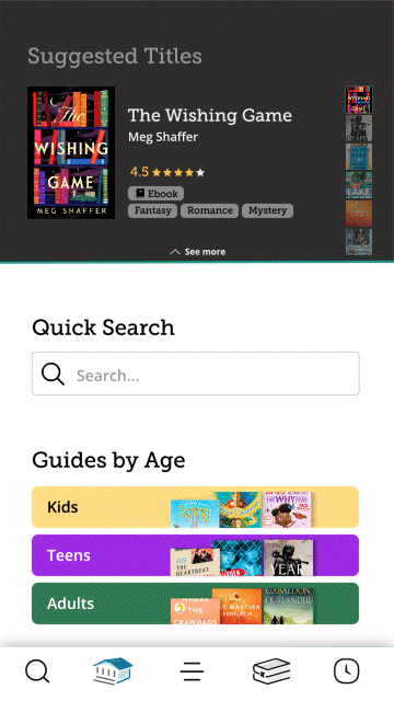
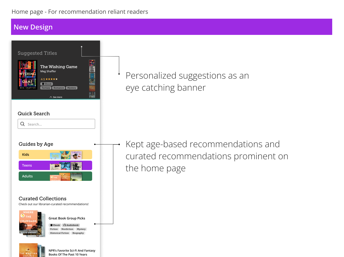
Personalized Suggestions: While sketching, I realized that the personalized suggestions feature could be used as a fun and engaging banner as well as serving a functional purpose.
These sketches clarified layout and interaction patterns, laying a strong foundation for wireframing.
Grayscale Iterations
Next, I refined the ideas using grayscale wireframes, focusing on the visual design and refining details like hierarchy, typography, and spacing.
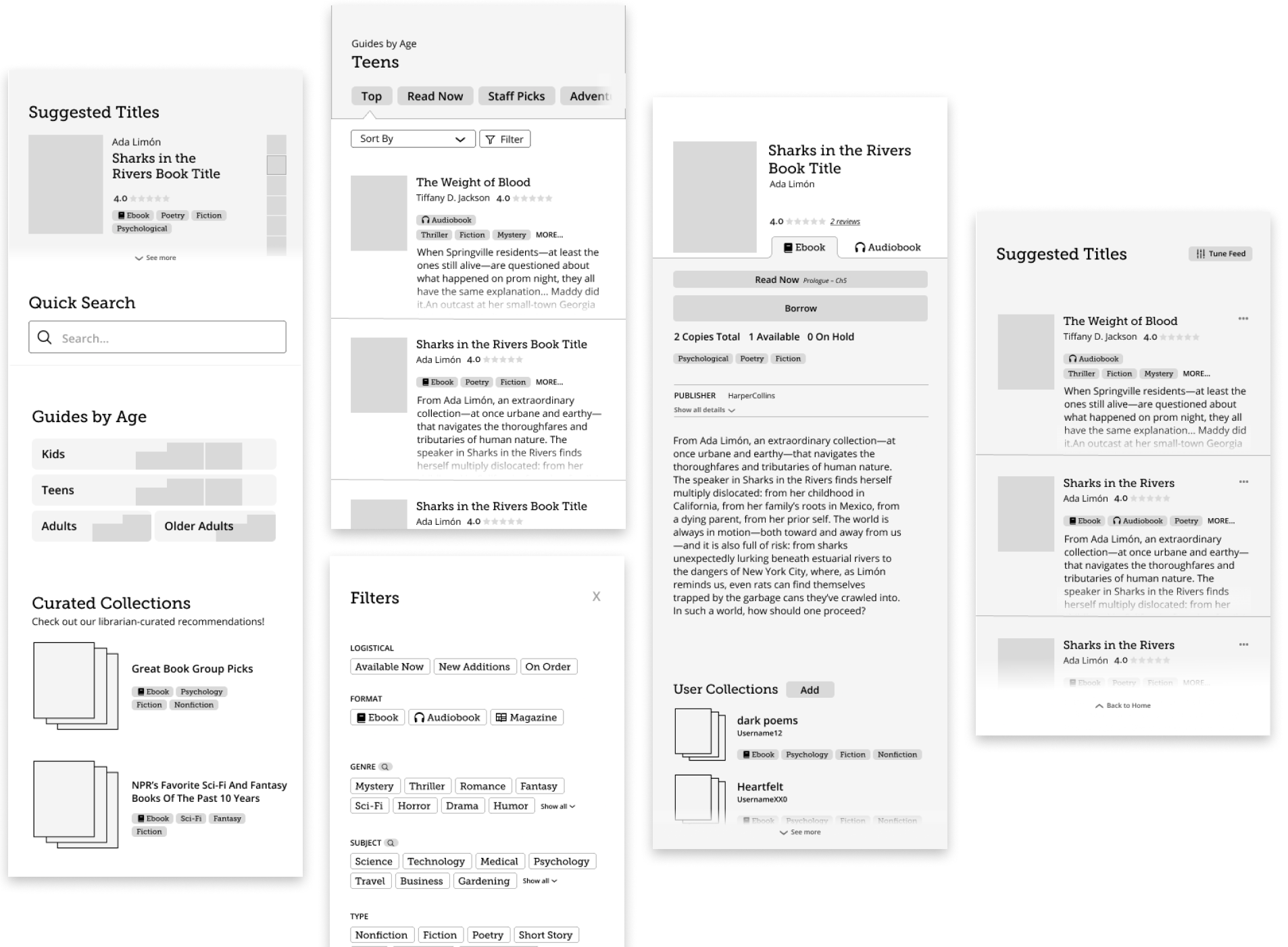
Some elements required multiple iterations, particularly the curated recommendations which needed to cut down on cognitive load while communicating that it is a collection of titles.
Branded and Animated Mockups
Finally, I translated the mid-fi wireframes into high-fidelity animated mockups using brand colors, icons, and animations to fully conceptualize the final product’s look and feel.
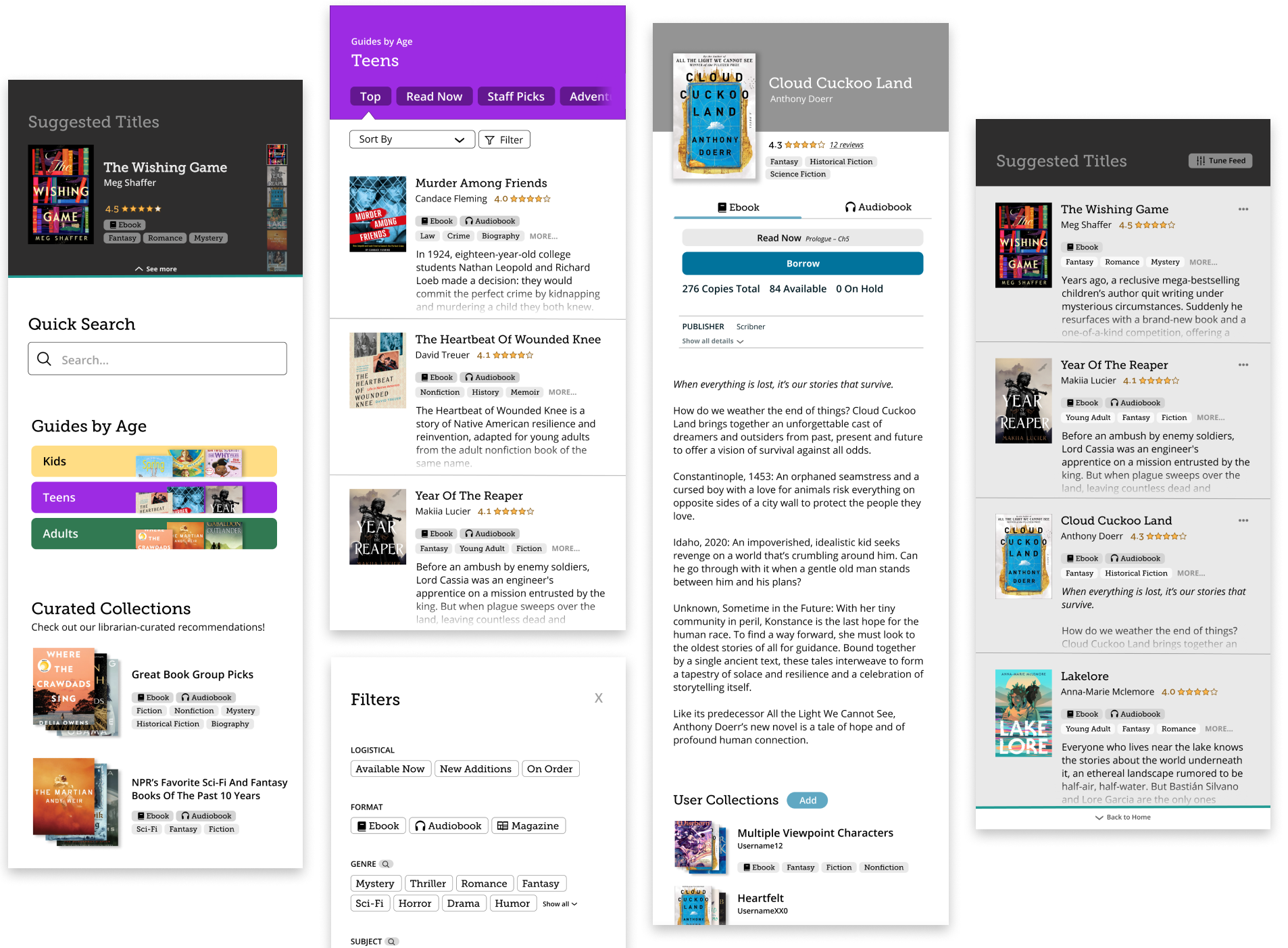
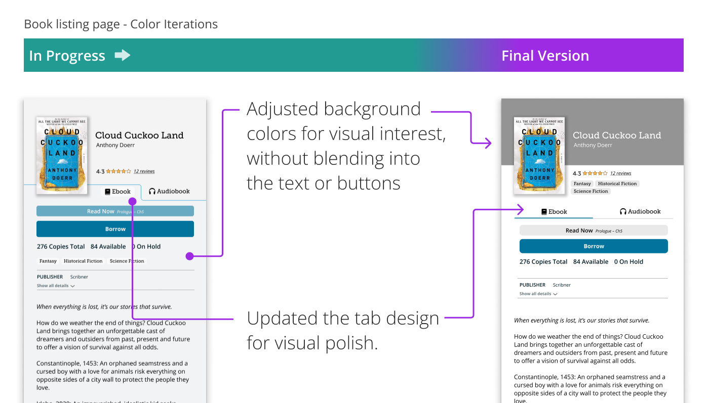
Although the details were mostly finalized at this point, one exception was the format switcher (eBook vs. audiobook), which required some iteration to discover a cleaner tab design and aesthetic color usage.
The animated mockups were first planned using a sketched storyboard, which allowed the animation process to be executed smoothly in After Effects.
Deliver
Solutions
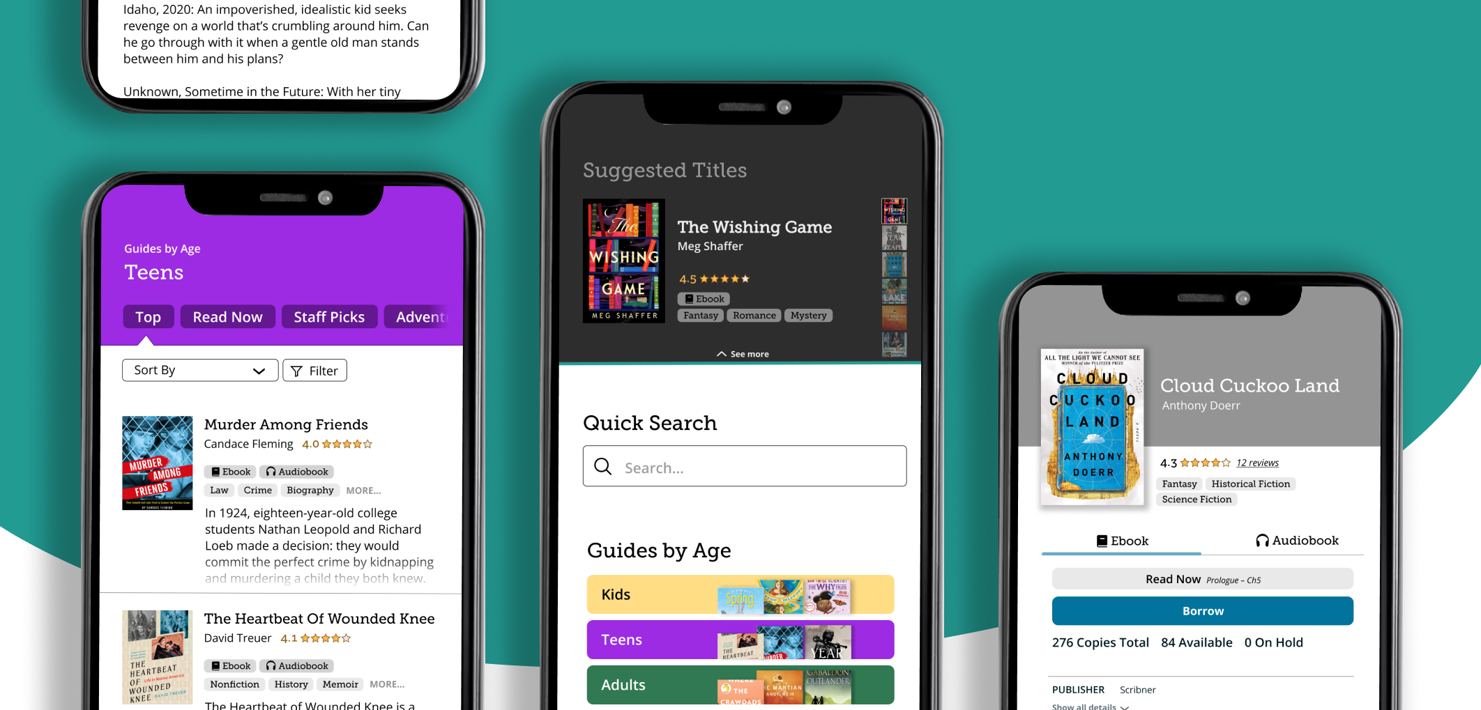
The final designs support all three discovery patterns while reducing cognitive load and prioritizing key information.
Selective readers
This user profile is neglected no longer, now empowered for discovery.
- Personalized suggestions: Selective readers can start exploring immediately and with confidence that suggestions are engaging and relevant as it is personalized to their borrowing and search history.

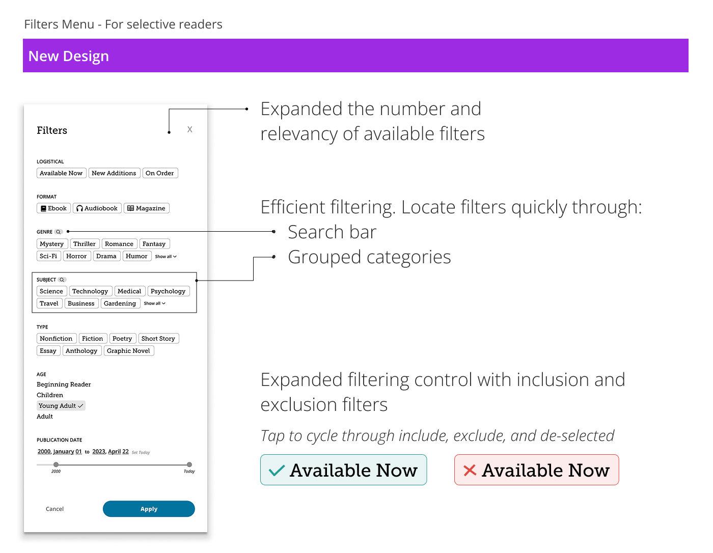
- Enhanced control and flow for filters: An expanded selection of tags enables users to better reflect their preferences. Tags are not only organized by genre, subject, and type, but can also be searched for even greater efficiency. Additionally, the filtering process has been streamlined into a single-line top-to-bottom flow, resulting in a smoother experience.
Recommendation reliant readers
Already well-served by the existing design, this discovery pattern (recommendation reliant readers) can rely on familiar strengths in addition to the new personalized suggestions feature.
- Recommendations prominent: Category cards and curated recommendations remain prominent on the homepage.
- Personalized suggestions: Providing even more recommendations, it is perfect for these users who rely heavily on suggestions. Thus, it is versatile, serving selective readers as well as recommendation reliant readers.
One-minded discovery ditchers
- Quick search: Since these users already have a specific title in mind, a quick search bar placed prominently on the homepage expedites their journey.

Cognitive Load and Structure
WIth a reduced cognitive load and a clarified structure, users can now enjoy a focused and efficient browsing experience.
- Streamlined recommendations: By reducing the number of options from seven to one per list, and by reworking the visual hierarchy, list titles are easier to scan—making it quicker and more intuitive for users to find something that fits their interests.
- Removed redundancy: Redundant entries are now combined, with clear format tags (e.g., audiobook, ebook) and helpful icons—replacing the previous version where format was only distinguishable by subtle differences like cover aspect ratio.
- Descriptive labels: Icon-only buttons replaced with clear, descriptive text removes guesswork and improves accessibility.
- Page structure: The redesigned header makes it clear that multiple lists are available from this page, making it easy for users to tell where they are and find what they need without confusion.
Decision-making cues
- User ratings and reviews: Based on unanimous participant input, user ratings and reviews were added. This will help users identify titles that are significant to them.
- Prioritized cues for efficient evaluation: Title overviews now display the key information users value most when evaluating titles to borrow. This allows for quicker, more efficient browsing—users can scan important details directly from the catalog without needing to open each title’s page.
Final Animated Mockup
Takeaways
User research is king
One of the most rewarding parts of this project was the research phase. It not only provided deep behavioral insights that informed the redesign, but also highlighted that my personal experience is not representative. For instance, I personally thought that the curated lists were completely useless. To my surprise, it was the preferred discovery path for a majority of participants. Although my classes had covered this exact issue of designer bias, this experience truly gave me the confidence to step aside from what I or other stakeholders “knew” to be right and instead, taking user research as the gold standard.
Focus on Flows
Putting together a suite of solutions to tackle real user needs was a highlight of this project. In addition, the broad feature set gave me the chance to explore a wide range of ideas. However, it also meant I had less time for holistic thinking and flow design. If I could redo this project, I would spend more time planning around the assignment requirements (such as the minimum number of pages) to focus on holistic flows.