Research
Visitor Reviews
In order to create a website that answers to user motivations, I dug into visitor reviews. In particular, I wanted to find out details like: who are the visitors, and what makes the Garden attractive to them?
SWOT Analysis
Tightening the scope of the project, the SWOT analysis revealed problem areas to tackle as well as opportunities for further enhancement.
Strengths
- The Garden offers a plethora of helpful services from gardening classes to guided tours
- The grounds are beautiful
- Free admission
Weaknesses
- Website has extremely outdated visual style
- Website is messy, with redundant pages
- Garden’s services are not promoted
- Garden’s needs are not promoted (The Garden needs community support)
Opportunities
- Promote the Garden's existing offerings that visitors love
- Appeal to the local culture, which is health-conscious and nature-loving
Threats
- The pandemic, which discourages people from visiting or volunteering
Define Design Needs
Client's + Users' Needs
For the Client: Bellevue Botanical Garden Society
- Bellevue Botanical Garden Society is a nonprofit organization that manages the garden in partnership with the municipal government, which is the City of Bellevue.
- The organization has 2 main goals: to raise funds for garden operations; and to engage and educate visitors to the garden, “...cultivat[ing] the bond between plants and people (Bellevue Botanical, n.d.).”
For the Users: Families and Couples
- Visitors are generally parents looking for a quick (1hr) activity for their kids.
- Couples are the second most common audience group.
Website Deficiencies
Outdated visual style
- The website’s outdated visual style turns users off and is a devastating mismatch with the garden’s status as the city’s #1 attraction.
Messy site
- Site navigation is split into 2 bars with no clear indication of differences and with apparent redundancies.
Weak CTAs
- Although the garden offers many wonderful services, awareness and promotion on the site (especially the landing) is weak.
Conclusion
How might we clear up the site structure and strengthen CTAs for key client & user needs with a refreshed visual style that speaks to families and couples?
Design
The Solutions
Solutions to refresh the visuals and clarify structure were relatively straightforward, while strengthening CTAs required more ideation.
Refresh Visuals
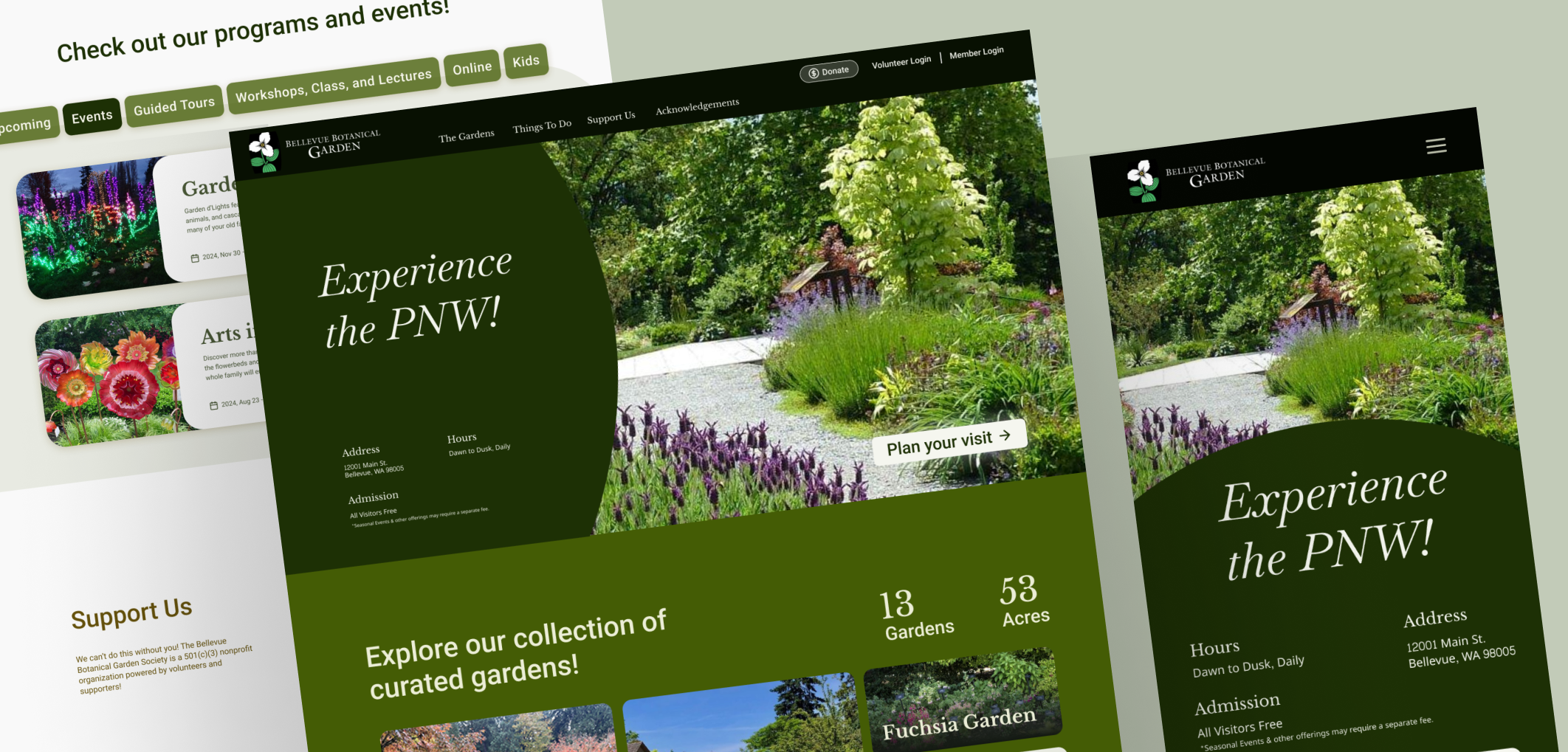
- Reconfigure visuals into a style that portrays the garden as an elevated and adventurous attraction, appealing to parents with kids and couples.
Clarify Structure
- Reorganize confusing navigational structure and remove redundancies.
Strengthen CTAs
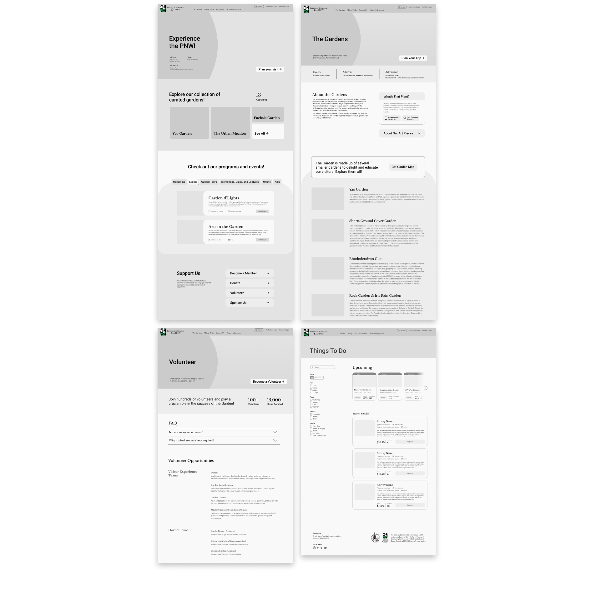
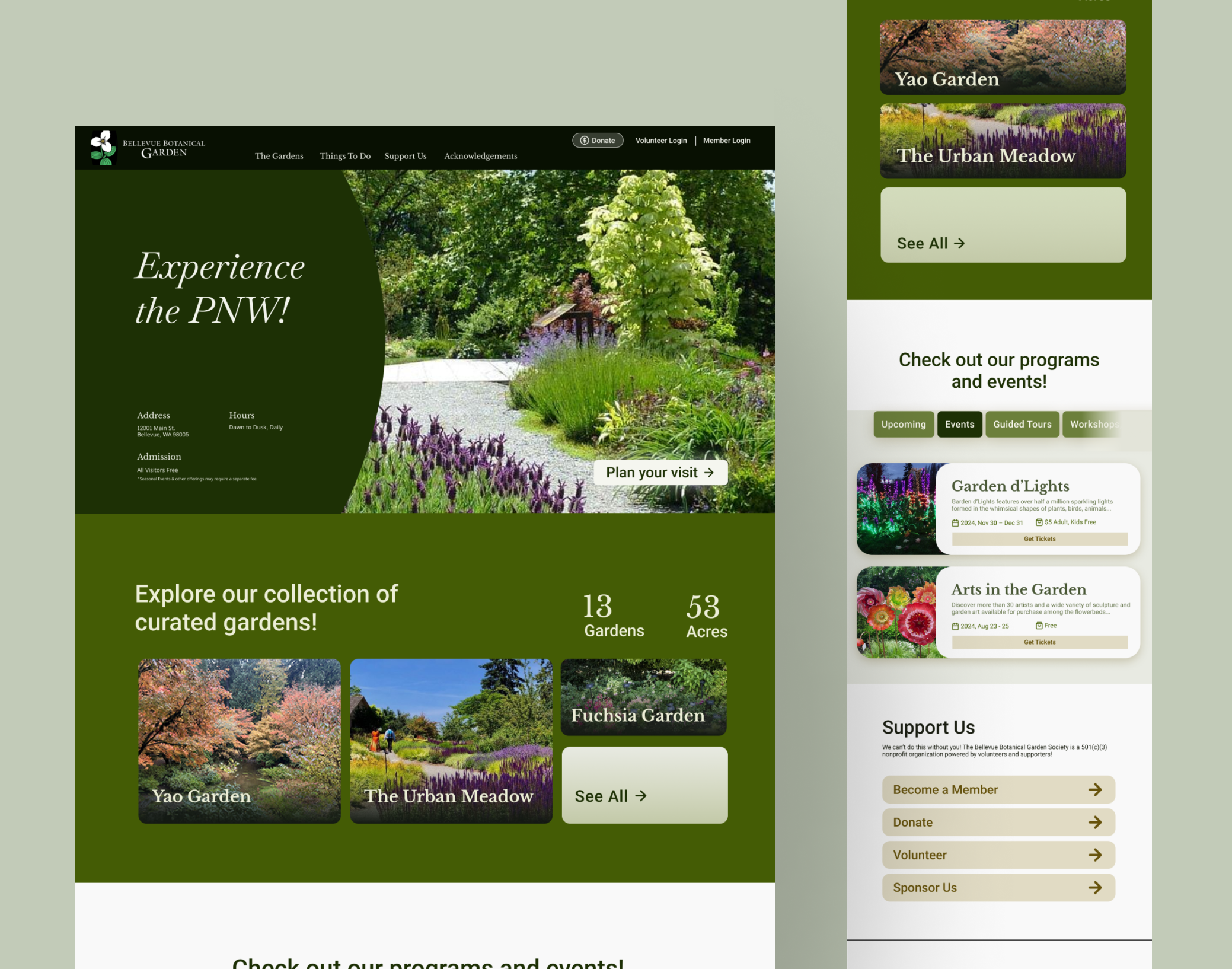
- Reduce noise by introducing visual hierarchy and paring down on content enabled users to focus on the CTAs for key actions. In particular, the landing features only 3 topics: a brief introduction of the Garden, a display of activities, and an encouragement to support the Garden. These topics align with the key goals of the client.
- Sliding in at the top of each page, a CTA button is displayed prominently, encouraging users to take action immediately.
Site Map
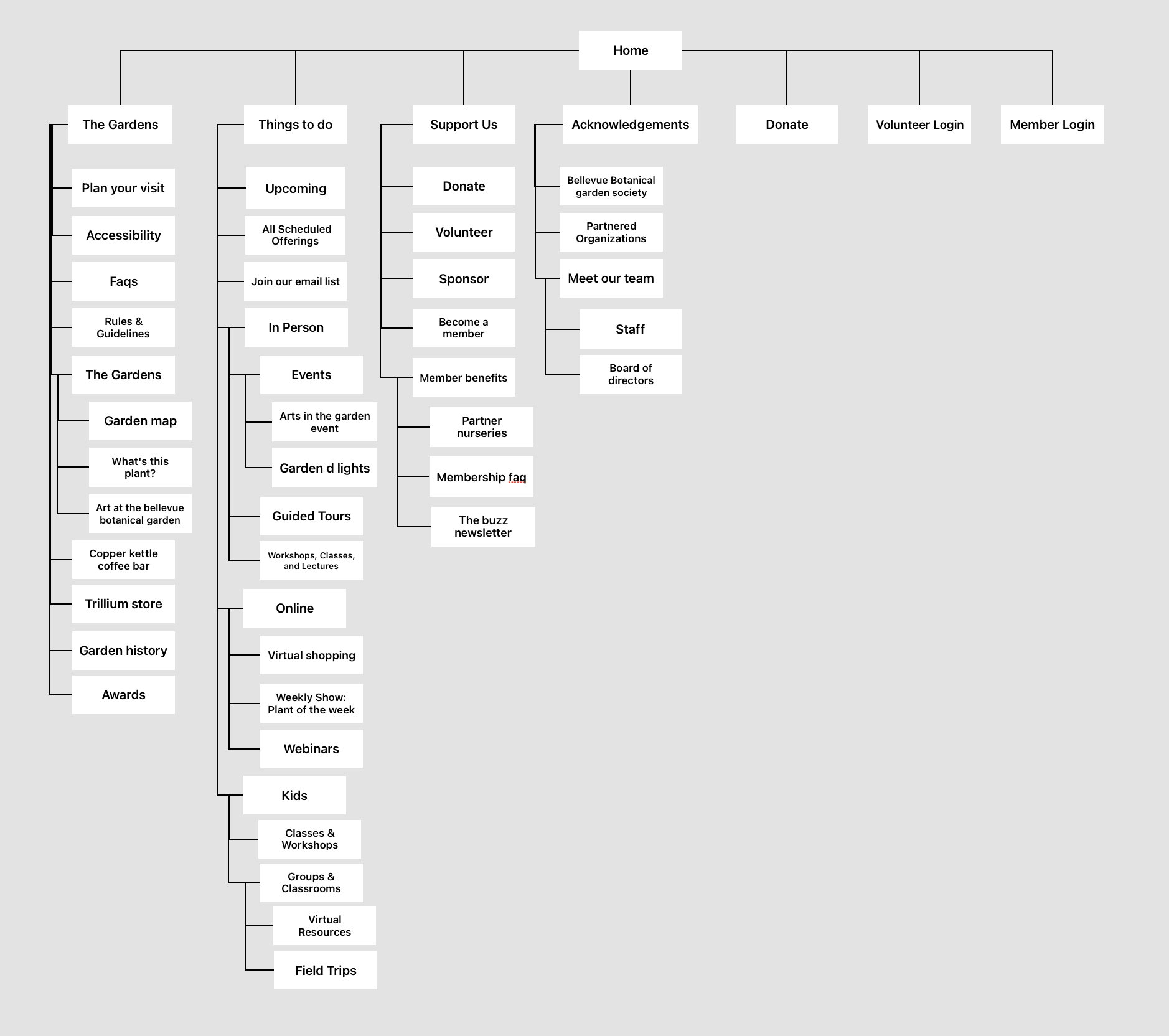
To clear up the site structure, I cataloged each page on the existing site. Next, I removed redundant pages and reorganized the site structure and navigation, focusing on reducing the number of top-level items and chunking pages into thematic groups.
Visual Style
To update the visual style, I started with a moodboard, and expanded it into a brand style including colors, typography, tone, and shapes. The original logo was quite classy and majorly informed the visual language.
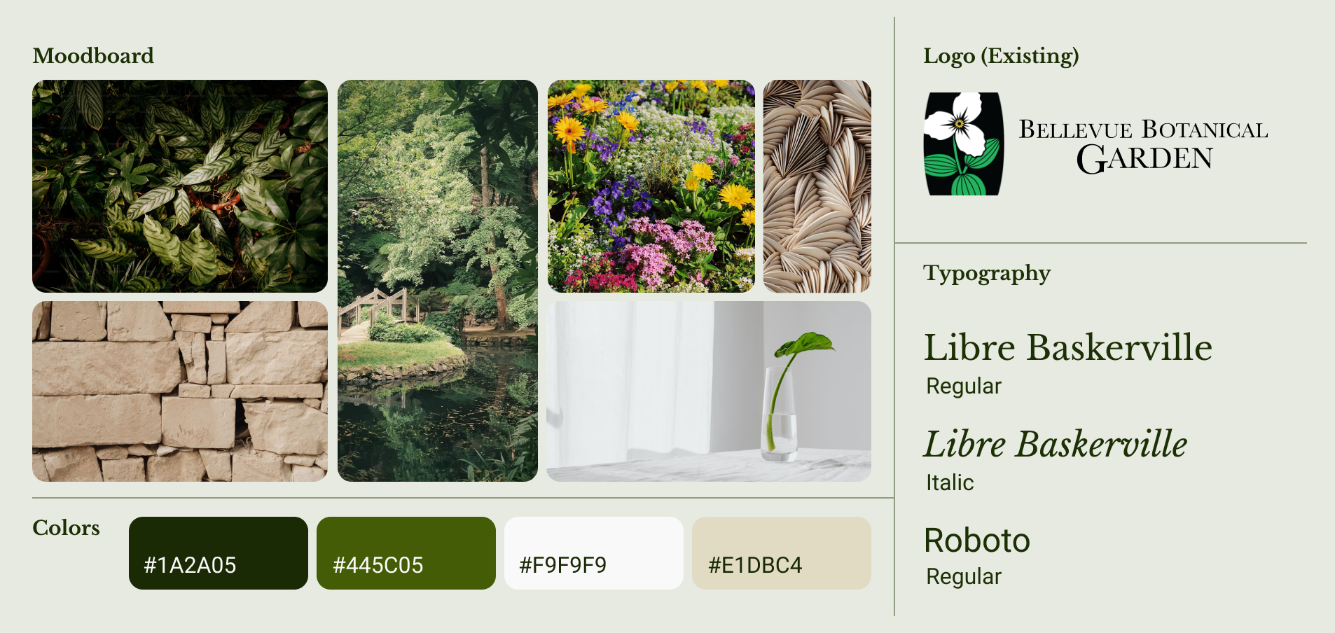
Moodboard sources
- Bunch of Leaves by Virginia Marinov
- Natural Stone Background by Unknown
- Green-leafed Plant by Fiona Smallwood
- Flowers Field by Avery Thomas
- Wall Made of Wood by Jason Leung
- Plant Seedling by Alocasia Macrorrhiz
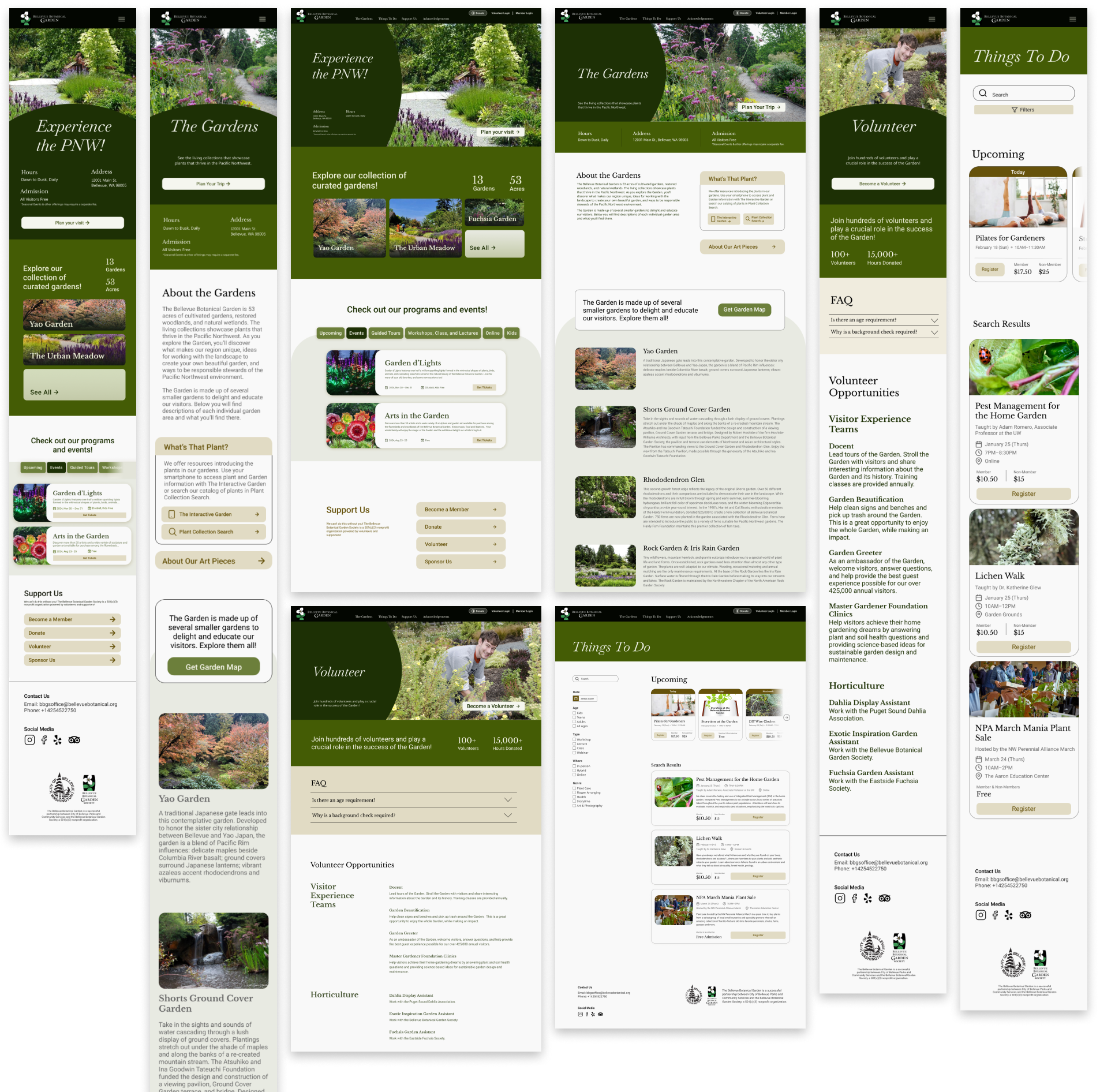
Wireframes + Mockups
Motion Design
Load and scroll animations were carefully added to draw attention to key elements without being visually overwhelming.
Reflection
If I’d had more time with this project, I would’ve wanted to spend more time on particular layouts, as well as adjusting details throughout the site. I’m generally happy with how it turned out, but I think additional balances in hierarchy would be helpful.
In addition, I would’ve wanted to dive deeper into user research, such as interviewing users or performing a card sorting study to evaluate the site structure. In fact, I was really bummed that I wasn’t able to work with rich data provided by real users. On the flip side, I now had an opportunity to practice doing 2nd hand research, which turned out to be surprisingly insightful.
Finally, I also used this project to learn how to prototype and animate in Figma. I’m impressed with the level of animation that can be accomplished with just Figma, and I’m stoked to have learned the basics and am looking forward to leveraging it for future projects.
