Research
Survey
Who are the users and what do they want? In order to get a picture of users' expectations and desires, I asked 5 participants questions that ranged from general (such as asking about their motivations for borrowing) to specific (such as asking about what types of information they use to decide whether to borrow a title).
Usability Tests
What do users really struggle with? A round of usability testing revealed and confirmed points of confusion.
Heuristics Analysis
Pain points were also discovered via a heuristics analysis using established guidelines for web design (I used the Web Accessibility Guidelines) and science-backed heuristics like Hick’s Law.
Insights + Define
User Behavior Insights
The behavior patterns & motivation that participants exhibited while searching for books fell into only 3 behavior archetypes.
Picky Reader
- They know what types of books they will enjoy & search for books that fit their preferred combination of genres.
- They are frustrated because the app does not have robust capabilities for detailed searching and filtering.
Searchers
- They had a specific book in mind and went straight for the search bar.
Recommendation Seeker
- They looked for recommendations such as library-curated guides, and were satisfied by the selection.
Since the goal was to improve the book exploration process, I also wanted to find out users’ inclinations when it comes to preferences. Was there a common pattern that I could leverage? In hindsight, the result was obvious: each person was unique.
- Some stuck with 1 genre, some with many. Some were exploratory while others were overwhelmed by choice.
- Thus, solutions for book exploration would have to be unique rather than being one-size-fits-all.
Website Insights
Separate from behavior patterns, the website's design had existing issues that confused users.
Mystery icons & site structure
- Mystery icons with no descriptive text confused users—especially as the icons are unique to Libby rather than commonly seen, standardized icons.
- The Teen Guides page looks like 1 list of books, but it’s actually several. This confused users.
Too Much Info
- Users are hindered by information overload such as being presented with unnecessary options and redundant listings.
Listings Miss the Mark
- Book listings lack the information critical to users. Users depend on user reviews, genres, and synopsis, but these are missing, lacking, or hidden.
Conclusion
In sum, how might we serve Picky Readers and enhance the experience of Searchers and Recommendation Seekers? How can we serve the great variety in book preferences? How might we resolve points of confusion like mystery icons & site structure, information overload, and listings that lack or hide user-desired information?
Design
Ideation
Brainstorming potential features to address the user behavior insights, I focused on ideas that serve the 3 archetypes, avoid choice overload, enable customization to fit unique preferences, and immediately engage users. As for the app design’s current points of confusion, I focused on a balance of providing user-desired information without overwhelming users.
The Solutions
After narrowing down my ideas, I decided on 4 changes to serve Picky Readers and enhance the experience of Searchers and Recommendation Seekers.
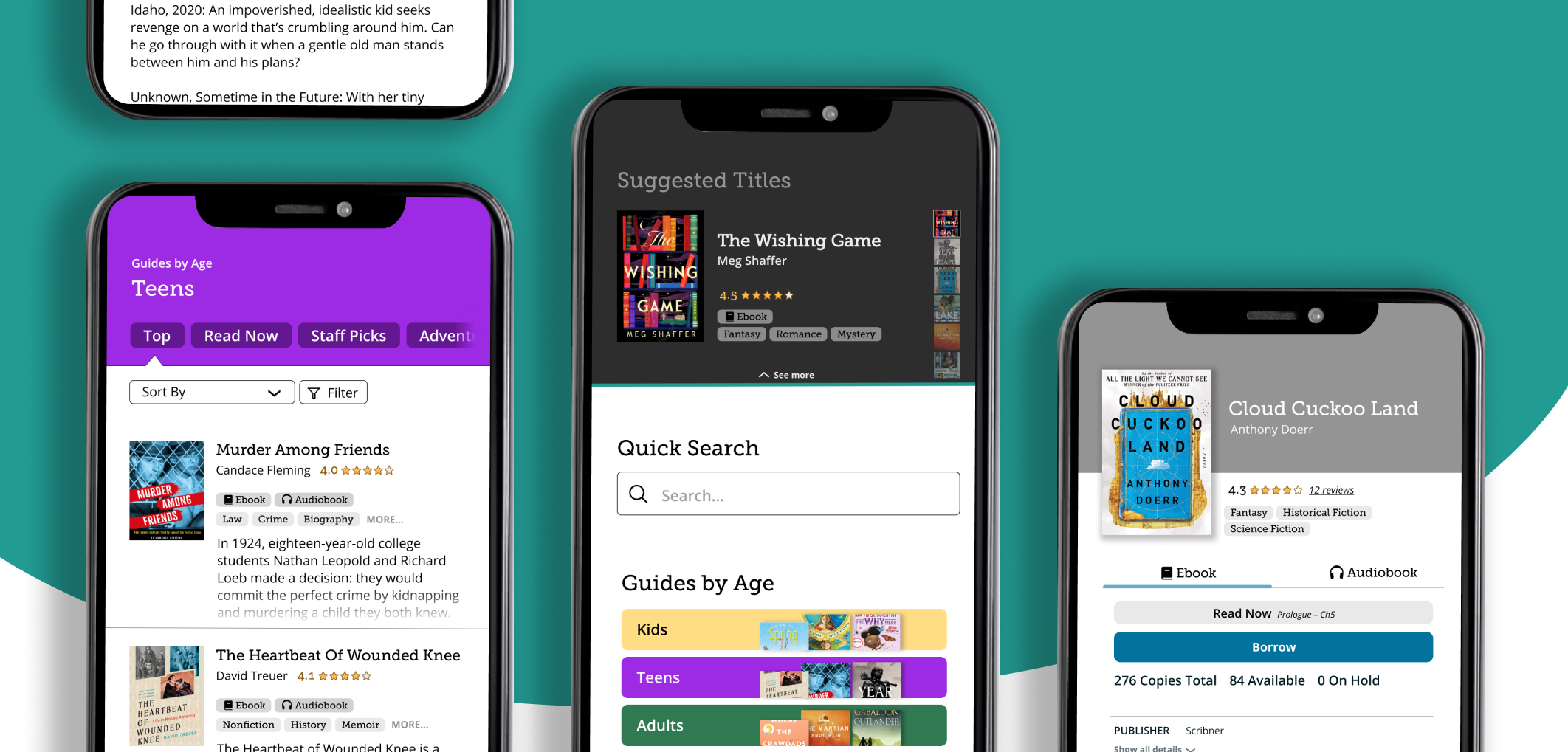
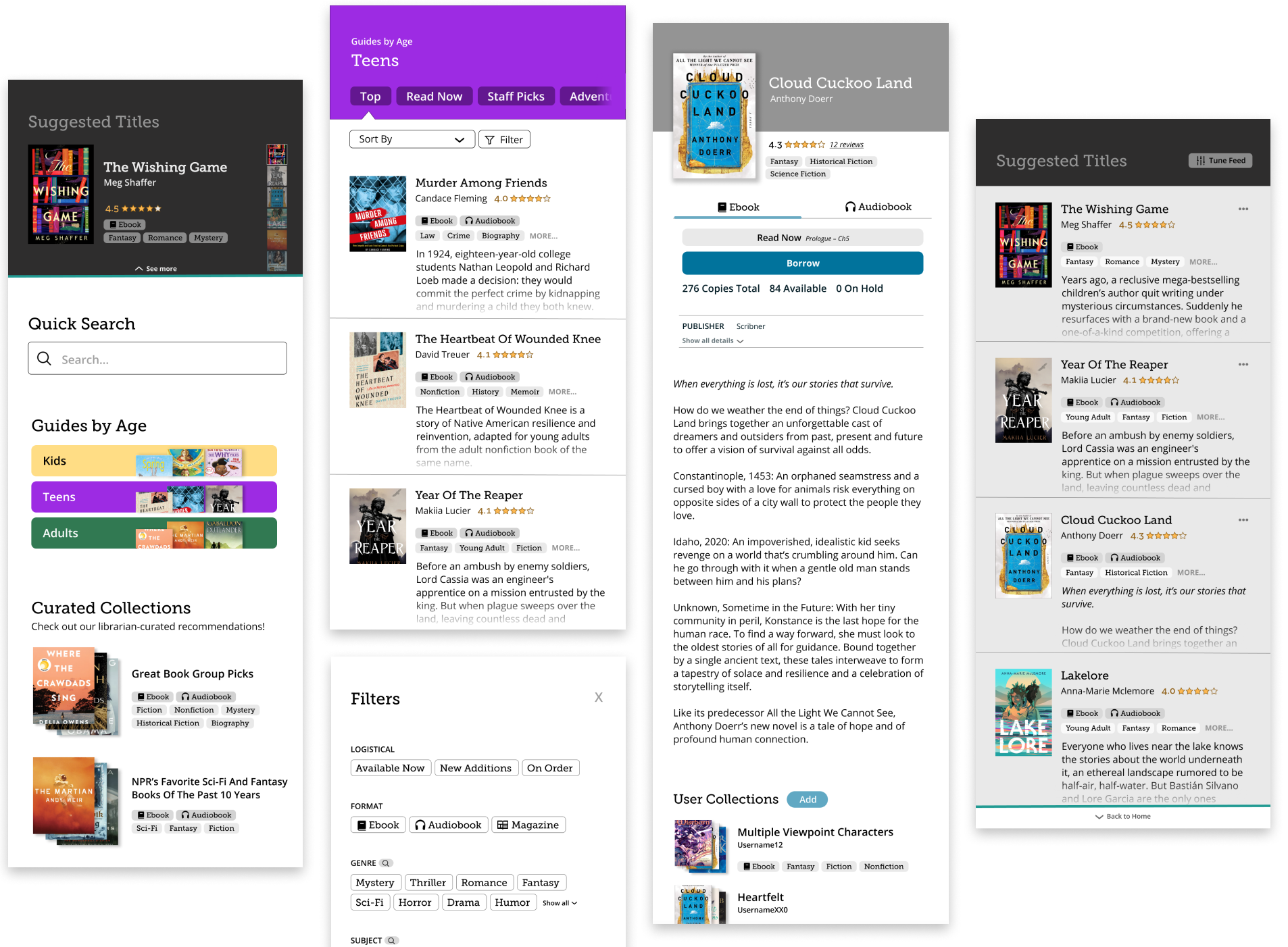
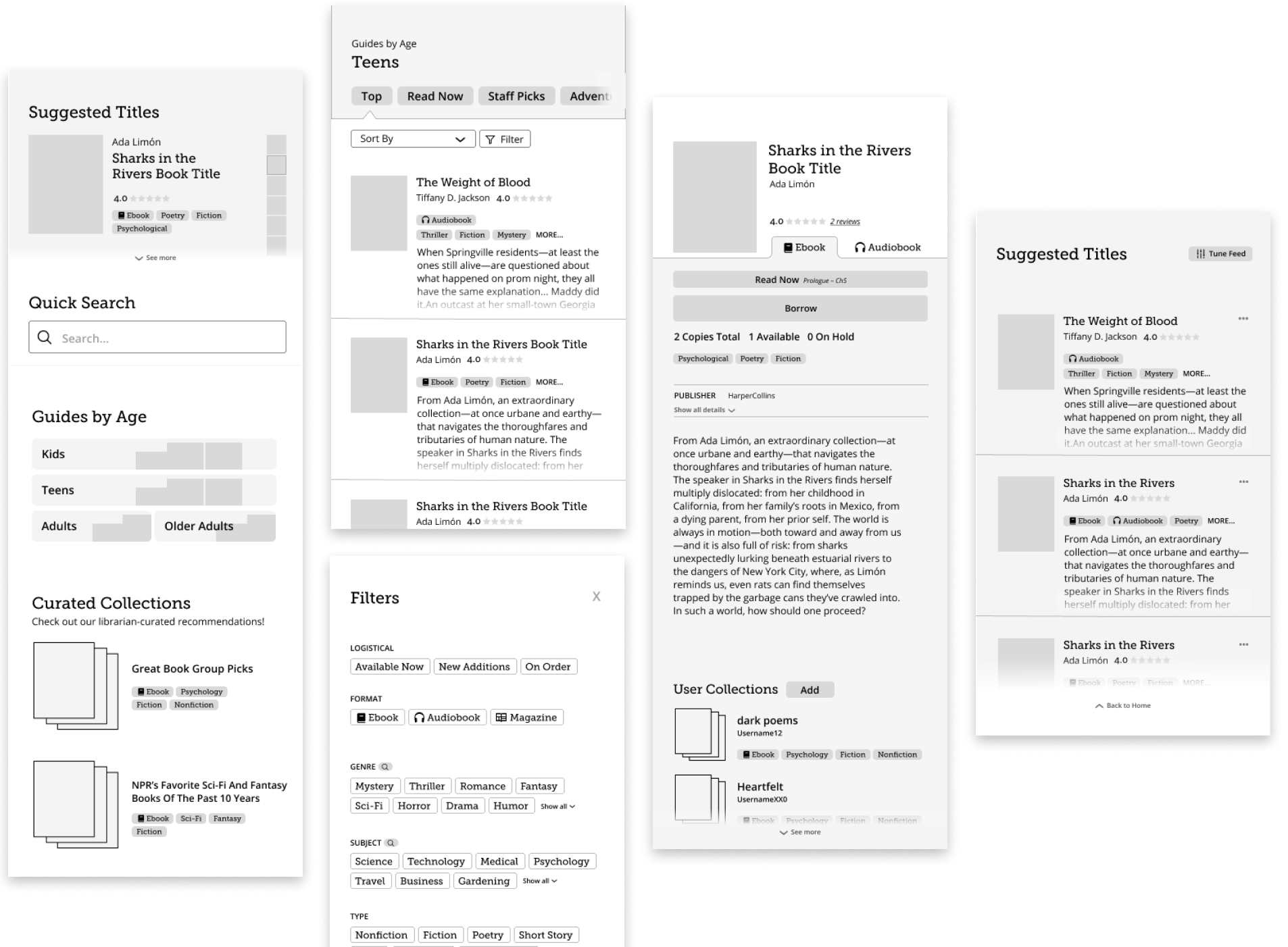
User Curated Collections
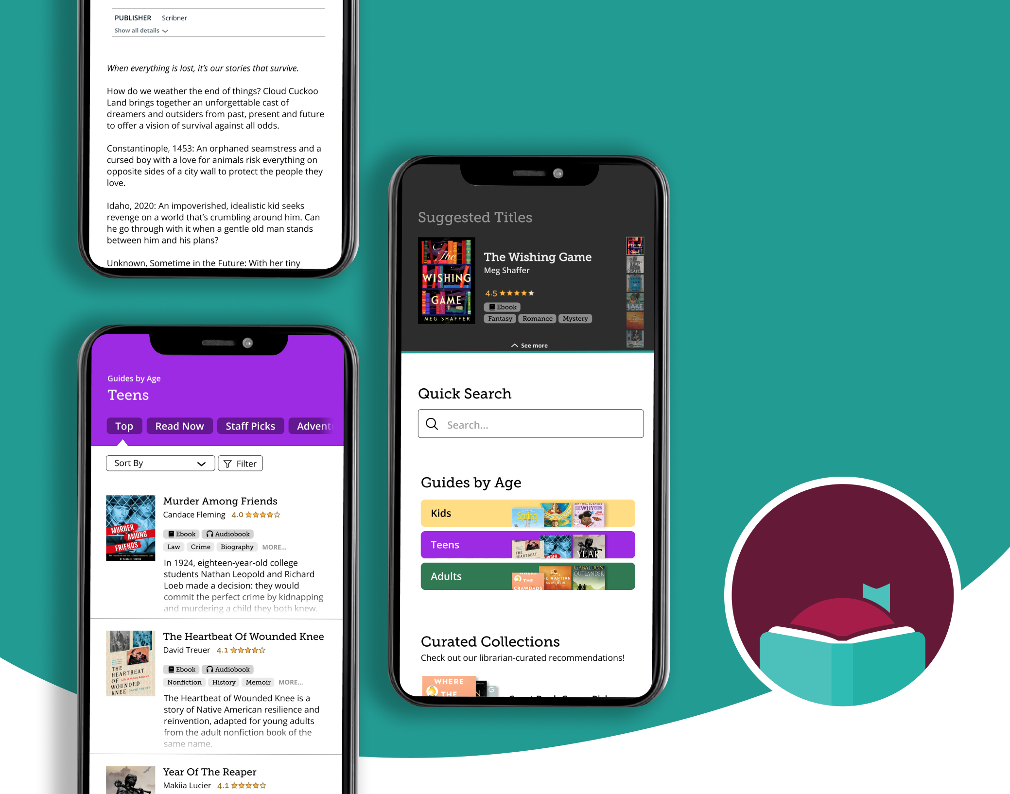
User-curated collections allow users to browse and share titles that fit their unique and specific preferences.
- Picky Readers can share recommendations with like-minded fellows, and search for titles that aren’t fully described with the standard genre tags.
- Recommendation Seekers get recommendations.
Personalized Suggestions
Users are suggested titles based on their likes and dislikes.
- Picky Readers get suggestions that fit their unique tastes, while Recommendation Seekers get recommendations.
- With a simple point of entry, users can get started quick without feeling overwhelmed.
Fine-Grain Filters
Users can apply a detailed combination of filters.
- A filter search features makes it easy to find a specific filter without wading through the long list of genres and subjects.
- Perfect for Picky Readers
Quick Search
- Adding a quick search to the main page serves the Searchers behavior archetype.
De-mystify Icons & Site Structure
- Added labels and removed non-descriptive icons.
- Clarified site structure with a tab layout enabling users to switch between multiple lists.
Prune Distracting Info
- Combined eBook and audiobook listings to remove redundancy
- Collapsed librarian-curated recommendation list into 1 clickable item.
Listings Show User-Desired Info
- Showed genres, user ratings, and synopsis in Iist view so users can quickly make a preliminary decision without tapping into each individual listing.
Wireframes + Mockups
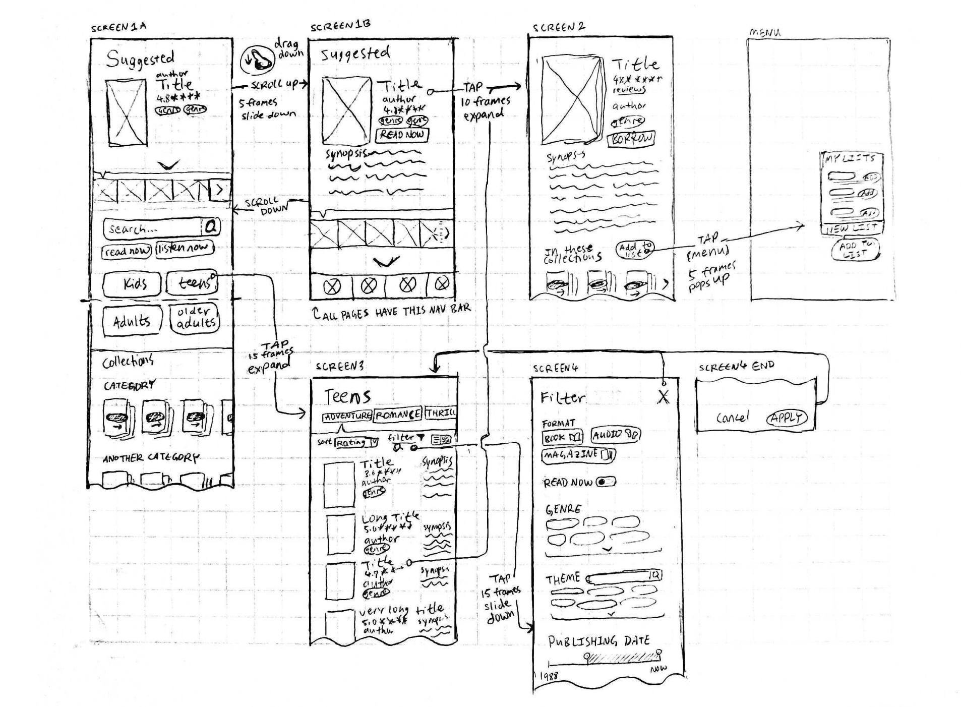
Motion Study
Transition and effect animations show structure and relationship between pages, and convey success of each user action.
Reflection
This project highlighted to me the importance of testing with real users. The obstacles and opportunities I discovered during research and analysis were very different from what I had personally expected. Testing ensured that I was addressing real issues.
If I had more time, I would like to create a prototype and conduct another round of usability testing. I also would also have liked to explore more facets of the app such as the dashboard, managing holds/borrows, and so on.
