Research
Client Requirements
Requesting a responsive e-commerce design, the client also provided existing branding, content, and a list of desired features.
-
Existing Branding
- Logo
- Typefaces: Gatwick, Public Sans
- Colors: Bright green (#7ed957), dark gray (#545454)

-
Content
- Product images, descriptions, names, and prices
-
Desired Features
- Search bar, email sign-up, careers page, and so on
Competitor Analysis
Users spend much of their time on competitor sites, which molds much of their behavior and expectations. As such, canvassing competitors will enable a design that first-time users can navigate freely, while using features they have come to rely on. Competitors to Step include DSW and Amazon.
Define Design Needs
Findings
Standardized Layout
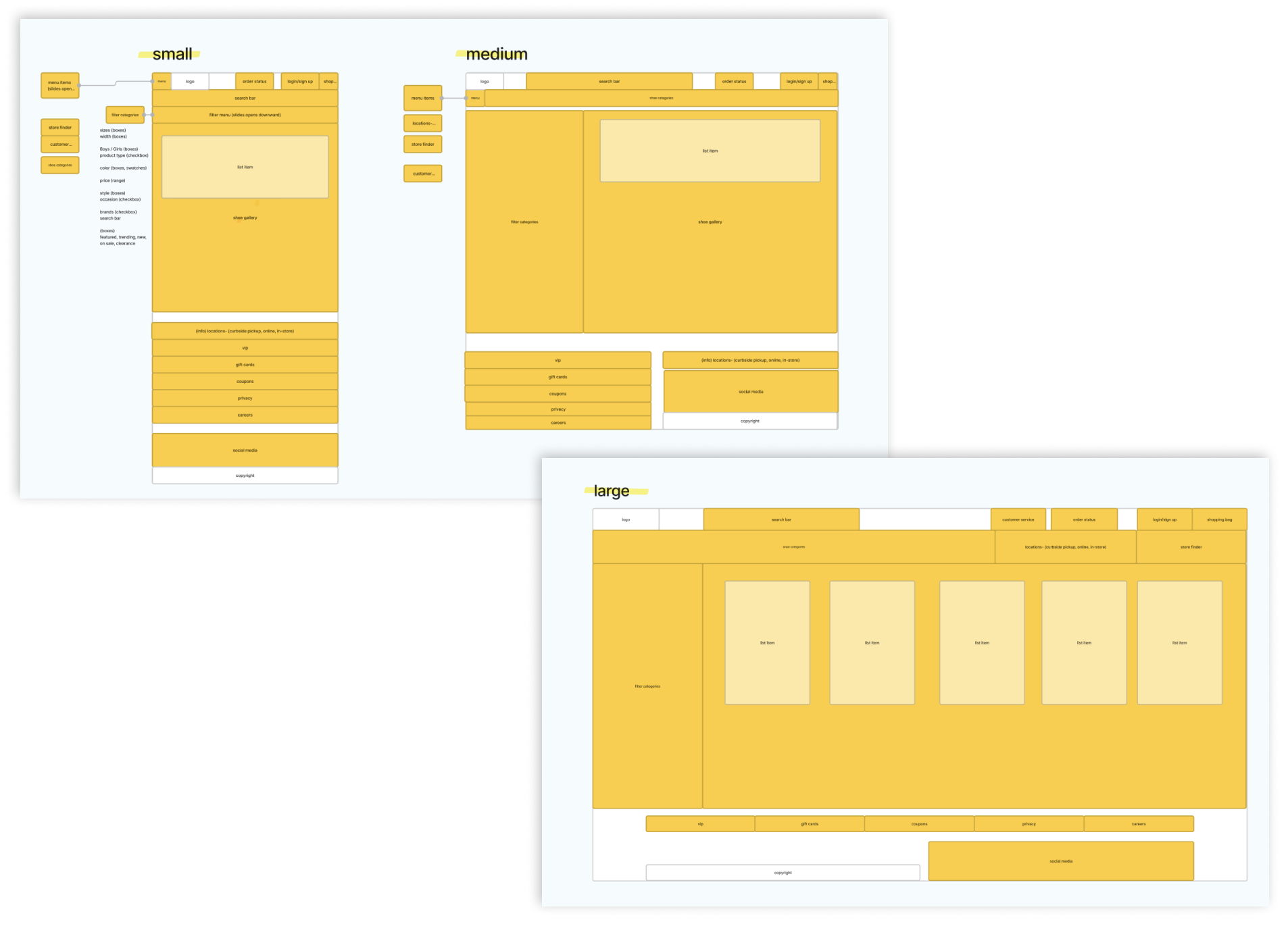
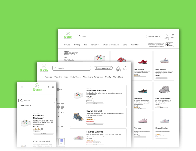
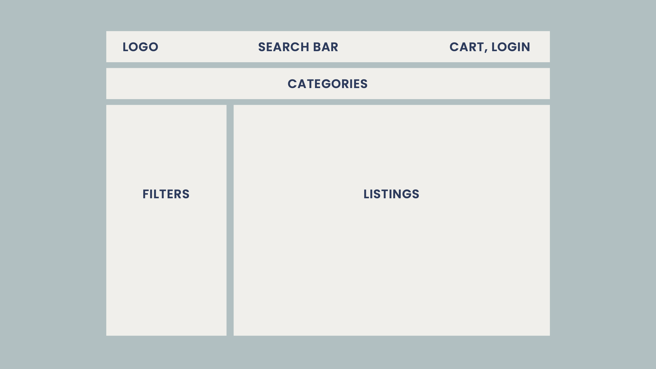
A standardized layout can be seen across e-commerce shoe-sellers, as discovered in the competitor analysis. In particular, the logo, search bar, cart, login, shoe categories, filters, and listings are generally placed in the same positioning shown in the following chart.
Filters
Contrastingly, the filters were not as standardized. Instead, each site had different filter selections, presentation methods, and input methods.
Conclusion
How might we ensure user success by presenting the standardized layout and enhance the filter options, while implementing all of the client’s requests and branding?
Design
The Solutions
Chunking
Chunking the features and navigation options into thematic groups make the site easier to navigate as users can remember the general location of related features rather than remembering the location of individual items.
Standardized Layout
Following the standardized general layout of shoe selling websites will make it easy for users to traverse the site, even if it is their first time visiting Step.
Efficient Filtering
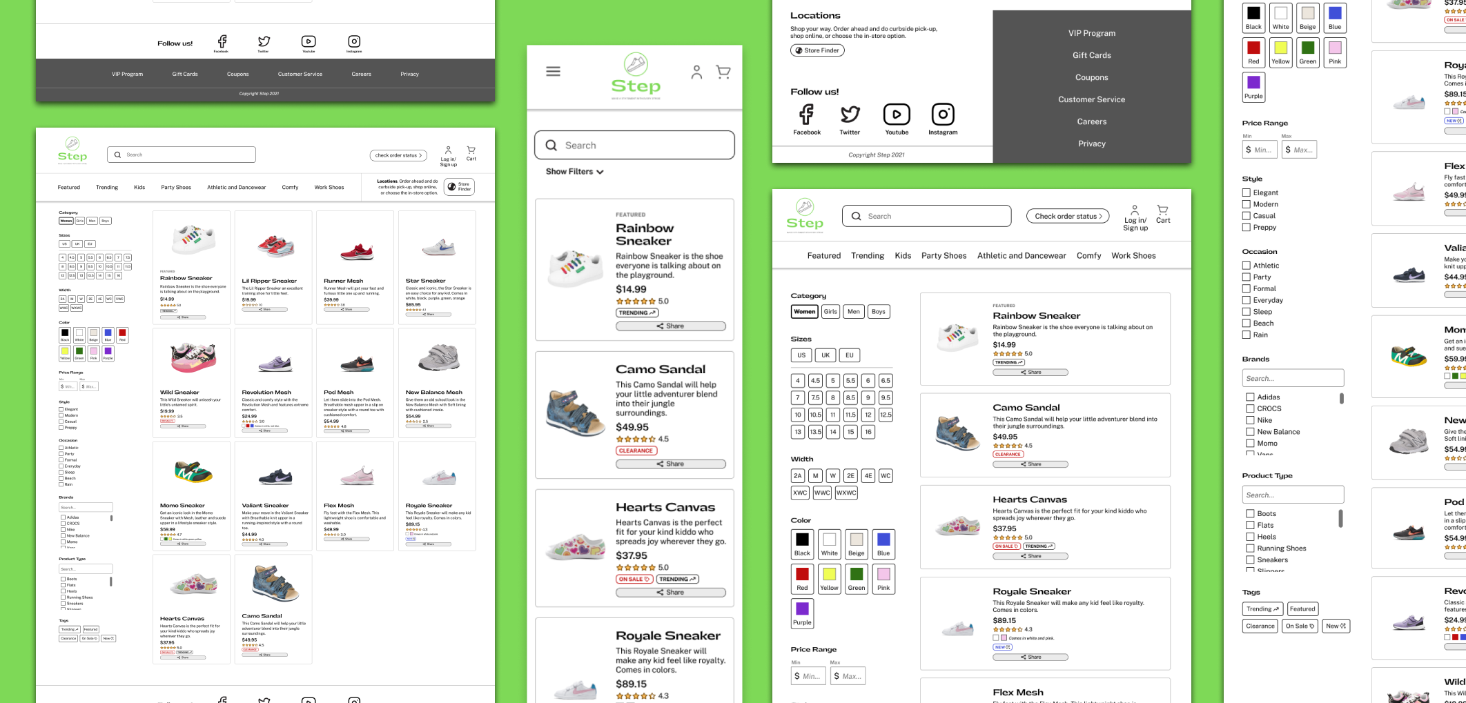
The filters provide mental shortcuts so users spend less time on filtering and more time considering the actual listings themselves. This is done by focusing on recognition over recall, efficient spacing, and clear signifiers.
- Provides swatches for color selection so users can skip the labels
- Sizes are laid out in a grid rather than in a vertical list—a space (& thus time) saving measure
- Shows options in order, such as widths from smallest to widest
- Includes a search bar to search within filters so users don't need to wade through a long list of options if they have a particular selection in mind
Wireframes + Mockups
Reflection
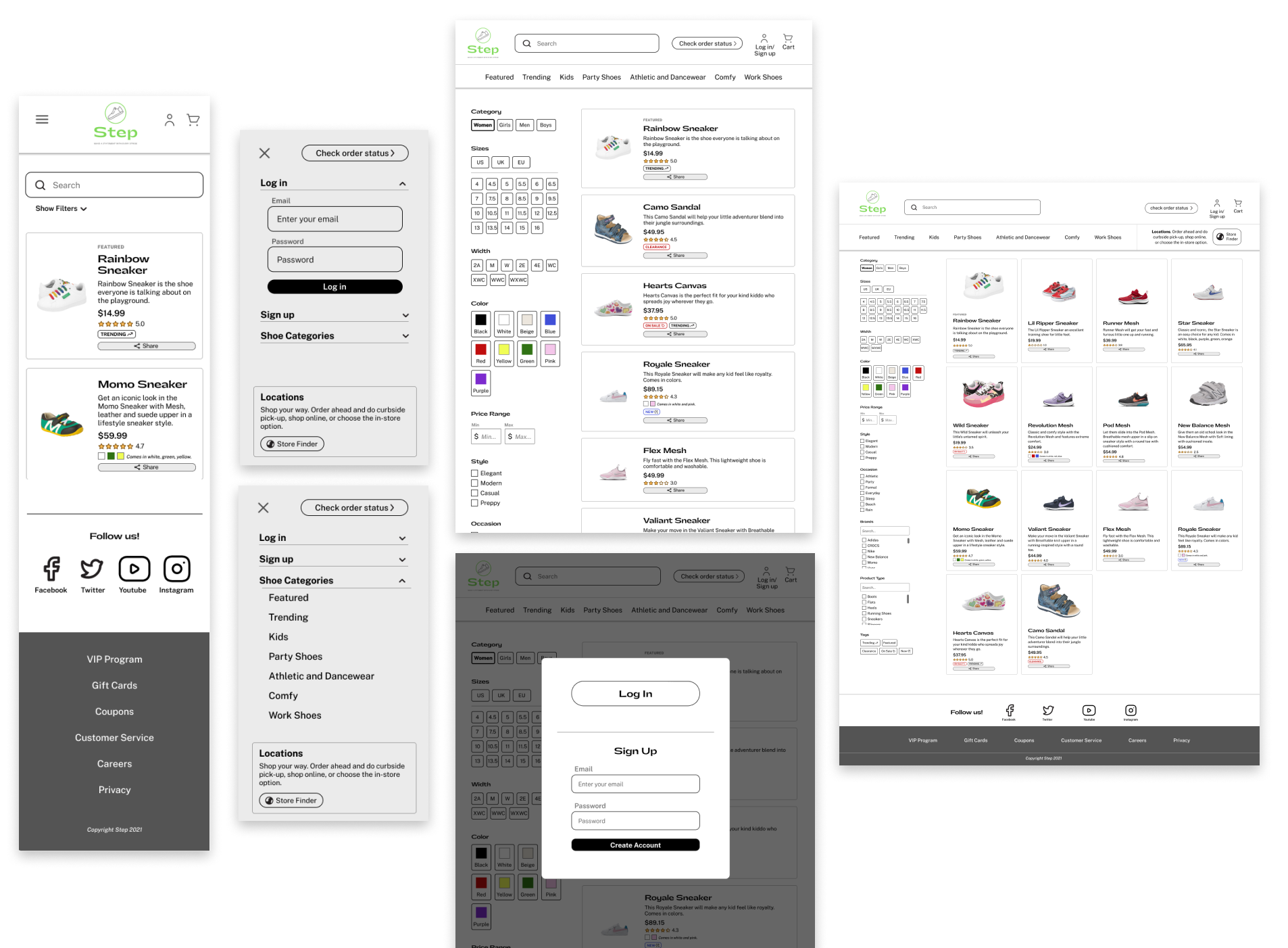
If I had more time, I would work on the visual balance of the designs. I’d also work on tightening the consistency of the login/sign up experience across the 3 sizes.
In this project, I learned the importance of low-fidelity mock-ups, especially the time-saving benefits for layout.
